j3rk wrote:Nice Mag, thanks. Oh, and... I didn't see this before, sorry:
GUARD!AN wrote:I'd prefer something that doesn't have a "generic" star wars kind of feel to it ... something more catered to siege specifically is really ideal.

I actually like this a lot. I'd like to make a few suggestions though, if I can.
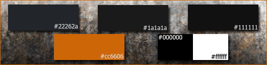
Make the "Reviving" white, 1px stroke in the forums orange color (#cc6606)
Make the heart monitor and top straight line orange.
1px stroke around the entire thing. (Just like I did on the color palette above, or my sig below. In photoshop, Ctrl+A, Edit -> Stroke)
This really just makes the entire image pop off the page a little. I recommend this step to anyone. Reverse the mines on the left side, so the mines on the right/left are pointing cross ways.
^I think those would make that banner look extremely masterful.